The Krueger Family

Website Design, Visual Identity Design, Copy-writing, Printed Newsletter Template

The Project Brief

Who are the Kruegers?

God has called the Krueger family to the ministry of constructing church buildings with Continental Baptist Missions for established congregations under CBM church planters.

The Big Problem

The Krueger’s website didn’t have any information about their ministry on it. Literally. And their method for reaching out to their supporters was time-consuming.

They needed a site that would present their unique ministry effectively and a new, faster way to reach out to supporters.

Greatest Challenge

When the Kruegers wanted send a newsletter, they emailed every supporter by hand and posted the newsletter to their blog.

They needed a modern, less time-consuming solution.

Now, when they post their newsletter on their blog, it gets sent to all their supporters automatically.

Outcome

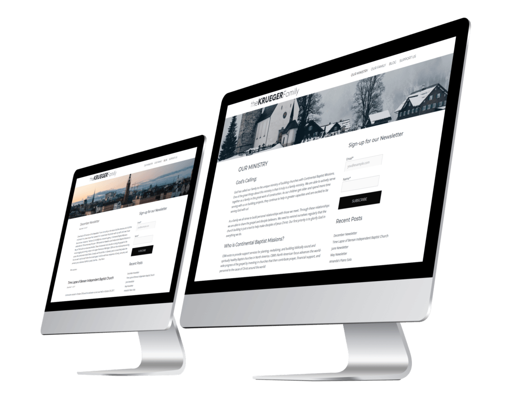
The new website clearly explains an easy-to-misunderstand ministry and provides a much easier to use way for supporters to keep up with the Kruegers.

The new visual identity gets out of the way of the content, and the printed newsletter allows readers to quickly find what they are looking for.

The new supporter update system automatically emails supporters when the Kruegers post a newsletter, saving the Kruegers valuable time.

Photo of two iMacs displaying the Krueger Family's website.

“Benjamin takes the time necessary to understand your vision for your website. He was willing to learn new technologies needed for my specific needs. The end result was a professional looking website…

He has the talent and skill set to get the job done.”

Process and Highlights

Process

Beginning Talks

We started to have conversations about what the Kreugers wanted on their website and what their target audience, pastors and ministry leaders, needed on their website.

We decided they needed a page that talked about their ministry, a page that talked about their family, a blog for monthly newsletter updates, and a support page with links for donation and a contact form. Additionally, the website needed to have a way for visitors to sign-up for their monthly newsletter.

Visual Identity

The Kruegers primary need was that of simplicity. Their previous visual identity had a ton of elements, including photos and fonts, that had to appear on anything with their name on it.

By simplying the visual identity down to a simple duo-tone stone-blue and white color scheme, a logo, and the font Montserrat, it could be adapted to fit a project’s unique needs rather than have to adapt the project to the visual identity!

Dummy Website

With a general visual identity in place, I created a “dummy website.” (A site to test out the designs I was envisioning and solidify the look and feel of the final site.) The Krueger’s feedback during this process helped to guide the general design and feel of the site.

Copy-Writing

While I was working on the dummy website, I asked the Kruegers to each write out a short bio. While they worked on that, I broke down their presentation and intro video and started mapping out the “Our Ministry” page. After doing some fact checking with Mr. Krueger, I wrote the page and handed it over to the Kruegers to revise and edit.

We agreed that the “Our Family” page should feature the story of God’s call to this unique ministry, so I interviewed Mr. and Mrs. Krueger one evening, recording the call, taking a lot of notes, and asking quite a few questions. Afterwards, I wrote out an outline summarizing everything and wrote out the story, once again sending the page over to the Kruegers for revisions.

Website Design

The website’s goal was to be an easily accessible source of information for the reader. With that in mind, I chose to go with a familiar layout that wouldn’t get in the way and allow visitors to quickly find what they were looking for.

Once I finished working on the design, the Kruegers gave more feedback and the design was revised until they were happy. One notable request was to create custom buttons for their monthly newsletter on the blog.

Highlights

Printed Newsletter

The goal was to update the newsletter to bring it in line with the brand identity established on the website and provide readers with a consistent, scan-able layout.

The new newsletter dramatically improves legibility by using a slightly larger point size and a consistent typographical hierarchy (the old layout uses eight fonts somewhat erratically).

Before

After