Oakdale First Baptist Church

Website Design, Photography, Initial Copy-writing,

The Project Brief

What is Oakdale First Baptist Church?

Oakdale First Baptist Church is a small, established church that has been faithfully serving Christ and sharing the Gospel in Oakdale, MN for decades.

The Big Problem

The site had hit or miss support for phones, didn’t have a lot of information for visitors, was missing content, and wasn’t doing the best job it could to reach people.

All of the pages on the site needed to be rewritten, and new photos needed to be taken for every page.

Greatest Challenge

The church had no set visual identity with the exception of a logo and one brand color.

With printed materials constantly in flux, the website needed to blend into the style of the church rather than become the style of the church.

Outcome

The new website is responsive (supports all devices), targets visitors, and has finished content.

Thanks to proper Search Engine Optimization (SEO), the new site quickly began to receive a stream of new visitors who are now able to quickly find the information they need.
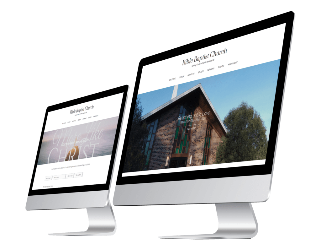
Photo of two iMacs displaying Bible Baptist Church's website.
Image coming soon

“Testimonial coming soon.”

Process and Highlights

Process

Beginning Talks

I knew the website needed a visual update, but when I mapped out the current pages and content, I quickly realized that its copy needed updating as well. After talking to my pastor, he agreed we needed a complete refresh.

Visual Identity

The visual identity was simple. I didn’t have one to work with and I really couldn’t create one, so maybe not as simple as you would think. I had to create a cohesive design and identity without a logo, color scheme, or brand fonts as the church wouldn’t be using anything I created anywhere other than the website.

Utilizing images as the main source of color and running with a black and white color scheme everywhere else solved the color issue; using sans-serif fonts Lato and Raleway for body text and headings solved the fonts issue; and using the serif font Prata as the site-title instead of a logo solved the logo issue. All of the elements work together to look great while no single piece stands out as being the “mark of the church.”

Dummy Website

With a general visual identity in place, I created a “dummy website.” (A site to test out the designs I was envisioning and solidify the look and feel of the final site.) I put in placeholder content and started to work out how this non-binding visual identity would on the site.

Copy-Writing

The website needed to be completely re-written and re-organized. I had the copy from the previous site, but I didn’t want to use most of it and what I could use needed to be revised.

I started by mapping out what pages and content needed to be on the website, what would be nice to have on the website, and the stuff we didn’t need from the old site.

After writing everything out, with a few revisions from my pastor, we were ready to finish the website.

Website Design

The website’s design is clean with low visual complexity and negative space. Incorporating large full-width images with the header on each page makes each page visually unique and instantly lets you know where you are on the site.

As the main goal of the website is to help potential visitors, the homepage prominently displays a link to to the visitor page above the fold.

Highlights

Highlights coming soon